A website is made of several components, such as a header, footer, menu, sidebar, pages, posts, CTAs, social buttons, etc. All these components work in sync with each other to fulfil our website’s objective.
This article simply lists the components of a website. So, check the full list carefully.
I have classified all these components into four categories:
- Structural components
- Featured-based components
- Web-pages
- Posts-components
Their name itself indicates its meaning. However, we will individually explain these categories in the article as well.
Let’s start with the first one.
Structural Components:
Those components that provide a structural framework for your website fall under this category. These are essential, so almost every website has these components.
1. Header
The header is the topmost section of your website that holds the menu, your site’s name, logo (learn the steps to create a free logo), CTA buttons, etc. It appears throughout the website, until it is intentionally removed on certain landing pages.

The above screenshot displays the header of the NxtDecade website. It has a menu, social icons, a logo, a search bar, etc. Its structure is built and customized using the installed theme.
Headers can have a variety of styles. These can even be made transparent or sticky based on your choice. Popular themes such as Astra and OceanWP have these features in free versions.
2. Footer
The footer is the bottom-most section of any website. It’s the opposite of a header. However, it works as the most powerful CTA as well as a gateway to other essential web pages.

A footer is presented in column format. Each of these columns is termed a footer widget. At the bottom, there is a row for a copyright note as well.
These links in the footer enhance your site’s SEO as well as provide easy navigation for website visitors.
3. Internal Links
Internal links open other pages of the same website. While external links direct users to different website’s posts and pages.
These internal links create a pathway within your website, connect to the “deep pages” of your website, and help them not go dead. Further making it easy for visitors to navigate across these pages and also allowing Google crawlers to discover pages or posts to scan and index.
Moreover, it’s one of the best technical SEO practices.
4. Sidebar
A sidebar is a column added beside the main content of your pages or posts. It enables bloggers to showcase their related or recent posts, along with CTAs or newsletter forms. There are three layouts of sidebars possible:
- Right sidebar
- Left Sidebar
- Both sidebar
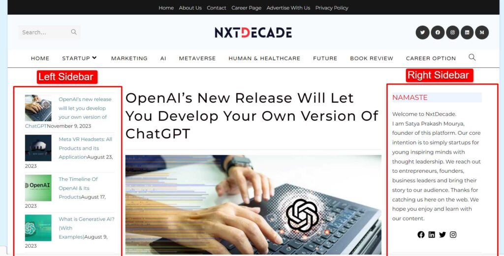
Sidebar width and content are all adjustable using theme options. A sidebar can potentially grow traffic and revenue if used smartly.
5. Background Color
The color scheme of your website represents your niche. For example, a self-help website may look best in green (in a variety of shades), as the color represents healing.
However, white is one of the most common colors used across industries as a background. Some tech websites use black as well. For example, “thefutur.com” uses black, while we (1millionblogs.com) use light grey as our background color.
6. Text Color
Ensure that the headline colors contrast with your website’s background color. For example, orange on royal blue or black would outshine.
However, a light background would need a darker shade. In addition, the subheadings and simple text should be visible enough.
7. Headings
Headings on the website describe each section of the whole webpage. For example, look at the headings on this web page:
A website should have relatable headings across all the pages. In simple words, all the headings should look similar to each other and not different across all the pages.
Learn: How to add and edit Headings?
Moreover, the type of heading tag you use also matters in the case of SEO. For example, a website using H2 may outrank another blog using H3 in its headings. Therefore, your headings are as crucial as your content.
Features-based Component:
Apart from the structural components of a website, such as the header, footer, blog, about us, etc., you can add extra features to enhance your website’s appearance and improve the user experience.
Let’s talk about these components:
8. Search Bar
A search bar can help visitors search for a particular product or blog post directly without manually looking into the archives. Thus, it creates a much smoother experience on websites with lots of blog posts.
However, you have to consider a few things while adjusting your website, such as:
- The search bar should also have a search button on the side.
- Launching the search should be easy with the “Enter” button.
- The feature must be in an easily navigational place. For instance, the Products page, or the Homepage.
You can add placeholder text. However, make sure that it’s in a lighter color and disappears when typing
9. “Scroll To Top” Button

Scrolling up to the top of a blog post with 10–15 page-folds is enough work to manually do it.
Who does that now?
Add a “Scroll to Top” button at the bottom corner of your page instead. Surprise! Your visitors can jump to the top with a click within a second.
10. Forms
Contact forms are popular among modern-era websites. In simple words, you place a form where people can enter their name, contact details, and intent to connect with you.
It looks like this:

Moreover, adding a Google reCAPTCHA is a must here. If not, your form might welcome bots to your site.
11. Subscription
People would turn into customers when you offer some value. And, the first step towards this is gathering emails of your potential customers. This can be done with subscriptions forms.
Once subscribed, the users get additional access on the gated content or premium content.
12. Payment Options
A range of payment options removes any barriers for your customers. However, you must study your customer preferences before considering any option.
It includes their region as well. For example, Indians would prefer GPay. But in the US, PayPal works the best. Here is a list of payment methods:
- UPI (GPay, PayTM, Phonepe)
- Cash on Delivery
- Debit Card
- Credit Card
- Amazon Pay
- PayPal
- Stripe
- Apple Pay
Note that all these payment methods work best regionally. Moreover, consider factors such as security, fees, ease of use, and reliability as well.
13. Videos

Search engines prefer to rank sites with videos 53% higher than those without any visual content. Even though it has become popular during COVID-19, the rise has been rapid and will stay the same.
In addition to great SEO, videos will help you retain your visitors. Hence, add high-quality visuals to your blogs and homepage and see the results.
14. Social Buttons
Social media pages and handles are a source of short-form content. That’s why some people find it fun to follow them. But what if you helped them find it more easily?
You can add buttons to your brand’s social media handles on different platforms, such as Instagram, Twitter, etc. However, note that people will only follow your brand pages for quality content.
Website Pages:
There isn’t only one page, the homepage, when it comes to designing a website. Each part of your website, such as your services, products, testimonials, etc., needs an individual page. In fact, a privacy policy page may seem useless, but it’s necessary.
15. Homepage
The homepage is the one that can either break the ice or send your visitors out of the cold. Hence, you must ensure that you offer something that keeps them sticking around.
Look at these 8 elements that your homepage must have:
- A strong, direct, and concise headline.
- A subheading describing how you can resolve the common pain points of your audience.
- The primary CTA button.
- Benefits of sticking around your brand. Answer, “Why should you be the one?”
- Social proof, including testimonials and case studies.
- An ebook or guide that solves some problems for your audience.
- Secondary CTAs.
- Key features of your brand and some resources.
Make your homepage look like the ultimate solution for your audience. And they will come back.
16. About Us
You may not believe it, but the “About Us” page is accountable for leaving your brand’s impression on visitors. That’s why it’s one of the crucial web pages of a website.
In simple words, this page includes three things: your brand’s mission, story, and services.
- While brand mission is important, ensure that it’s not being spoken directly. Include it in the form of a story.
- The brand story holds a special place in the visitor’s heart. Here, share—the birth of the idea, challenges, and your aim for the future.
- Lastly, share your services and how they benefit your customers. Also, how do your services align with your aim?
17. Services or Products
Whether you’re a freelancer or a business, the way you show your work matters the most. For instance, a minimal design makes the best list of services or products. A good services or products page has a list in a horizontal and spacious manner.
She is a self-help writer, and so such a design creates a soothing effect. However, you can choose the pattern according to your site’s niche.
Tip: A blogging website can also sell digital products, such as eBooks. Learn how you can set up a full-fledged passive income.
18. Testimonials
People never trust anything easily. First, they’ll hear about your brand, and then they’ll take any step. In addition, they’ll look for confirmation before investing a penny.
Good reviews and testimonials work for you, then. The better you show people, the more they’ll find you credible. In addition, show them not a few but more quality reviews.
Read the story of JagrukbanoIndia Blog.
Here’s why: People look for at least 40 quality reviews before believing in your business. So, offer a great customer experience, and there you go!
19. Sign Up/Login
The Sign Up and Login pages are crucial for websites minting money off their subscribers. After all, who doesn’t do business nowadays?
Adding a signup page to your website would be beneficial if —
- It’s a commercial website, like Amazon.
- Or a community forum
Moreover, bloggers can offer premium content at a price and so, add a signup page.
20. Contact Us
E-mails and contact numbers have added one more style.
Another popular style is form. In simple words, people can leave their details and message on the form. Later, you can connect with them.
But the best is to keep all of them hanging on your “Contact Us” page.
21. Careers
Many companies have a ‘Careers’ page in case a potential employee hovers over the website. However, is this page limited to open job roles and new job updates?
Not really. It has two more components, and the very important ones are:
- The company’s mission inspires others to join the venture.
- Company culture and how it works.
Talented people look for a good work culture. So, you must add this up.
22. Privacy Policy
Any website’s privacy policy page shares whether it collects visitors’ information or not. It also shares how that information is being used and if it’s being sold.
A privacy policy is a must for e-commerce or online shopping websites. But wait, it’s important for all the websites, even blogging sites. Here are a few reasons why:
- It comforts visitors and builds trust with them.
- The privacy policy is crucial for SEO and marketing purposes. Moreover, it is an important page for the approval of Google AdSense.
- It’s a law in most countries, including the US, Europe, and India.
Lastly, add one if your site uses cookies and mention the same in it.
Blog-related components:
Adding a blog to your website can help increase website traffic by 55%. Even better, it can help your brand get exposure to a brand new audience. So, here are the components needed to create a blog section.
23. Featured Image
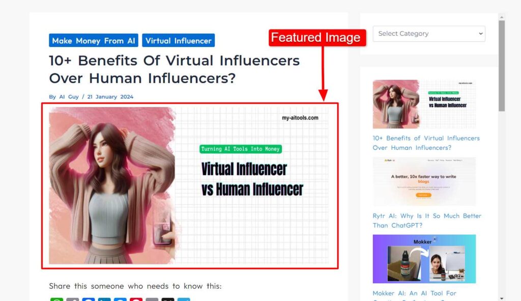
Featured images represent the theme and the information type of a blog post. Sometimes, they are also referred to as post thumbnails.
Featured images are usually a big picture at the top of a blog post. In addition, they play a huge role in explaining the post when it’s shared, as the first thing that people see is the featured image.
Therefore, you must add it to your blog.
24. Categories and Tags
Categories and tags don’t only sort blogs for visitors, but for Google too. Here’s a simple explanation:
The slug of your blog post has “category” included. So, search engines can easily figure out where the content needs to be ranked. Moreover, your visitors can jump to any category they want to read about.
Therefore, create a category for each type of blog on your website.
25. Call-To-Action (CTA)
Your write-ups must not leave the reader without a direction. It’s like sharing a destination but never the map. So, a clear CTA is a must but, only one of two types —
- It could either be a general CTA to direct the reader for the next step.
- Or it could be a strategic CTA directing the reader to your business’s doorstep.
26. Author Box

Author box gives writers authority over their write-ups. For example, freelancers can show off write-ups on their name to prospects. Thus, every website must have an Author Box.
This small section is usually at the end of the blog and contains —
- The author’s name, image, and their basic information
- Their social media links
- The author’s e-mail address
Moreover, ensure that you keep it short, share the writer’s credentials, and write it in the third-person tone. Note that the writer’s expertise in the niche enhances SEO as well.
27. Newsletter
Newsletters are an excellent way to communicate with your customers, share new business news, and more. In addition, you can expect high gains from promotional emails.
An average email marketing campaign returns $36 for every $1 spent. But do people even open their emails now? 55% of customers like to know business news via email. If you can write a catchy hook, and make them stick till the end of the email, all good!
So, set up your website’s newsletter on the sidebar or at the end of the blog! There are several email marketing platforms/software that facilitate users with complete email marketing environment:
- MailChimp
- Brevo
- Zoho campaign
- Active campaign
- OptinMonster
- HubSpot
28. Comments
After newsletter subscription comes the comment section…for a reason.
People care about their opinions, and even more when you hear them out. This is why 77 million people spend time writing comments on blog posts.
Moreover, comments can help you build a supportive community as you create what they want. And you wouldn’t run out of ideas too!
But spammers can spam your comment section too, with negativity. Seth Godin never had one for that very reason.
So, the choice is yours to keep the comment section enabled or disabled.
29. Related posts
At the bottom of your blog post, you can list related post in the same categories. This can help to increase your page views.
