Every website—business or blog—needs a logo and an icon.
Your logo is the symbolic identity of your blogging website. It’s visual in nature; hence, it easily imprints in the minds of your audience compared to textual representation. Therefore, logos and icons are the major branding factors.
Creating a logo and an icon is not as simple as it may sound. Companies spend hundreds or even thousands of dollars to get their final logo, icon, and related things.
But, as a blogging beginner, I don’t want you to spend even a penny on it. Therefore, I am going to guide you on how to build your website’s logo and icon for free using Canva and other logo-making tools.
Let’s first understand the difference between a logo and an icon.
Difference Between logo and Icon
Most of you have heard about logos, but what is this icon? Where is this icon used? And how is a logo different from an icon?
The logo is the full version of your visual branding. It is used at all such places where 100% branding is needed. For example, in the header of your website, full branding will not result in a poor user experience; however, icons are light versions or shorter versions that are used as dim branding without overbranding.
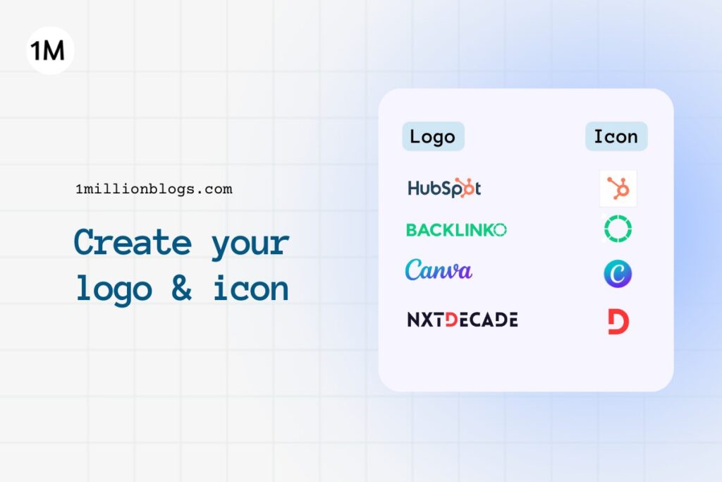
Here are a few examples of logos with their respective icons.
Furthermore, icons are square in dimension. Mostly, it’s 512 x 512 pixels. These icons are also used for app representation on mobile devices or desktops. In browsers, icons are used as favicons as well. The word favicons itself is made of two words: favourite and icons.
There are several other important places where icons are used instead of logos, and we will find out that in the coming sections in more detail.
Tips to Build a Good Logo
We will be using Canva to build your logo and icon.
But before you start pouring your creativity onto a Canva page, I want you to understand some of the basic features of a logo, along with a few tips. These tips will help you make a better logo and icon.
- Keep your logo simple. Simple logos are more memorable. Do not fill your logo with too many elements, as that will complicate the logo.
- Your logo and icon should appear meaningful at different sizes. Whether on a bottle cap or on a huge banner, your logo should be easily recognizable.
- Use typography that fits your brand. If your niche is around style and fashion, use a stylish font style with curves and bends. For websites with bold topics, using bold fonts and typography will be more relevant.
- Use color psychologically to reflect your brand message to your audience. Don’t use any random color. Use a hexadecimal code for your colors to stay consistent.
- Stay Original. Don’t try to replicate your competitors logos, as that may lead to a poor impression on your readers.
Also read: How to build a strong blogging mindset?
How to build a Free Logo?
Good research is needed before you get to this stage. Keep your basic requirements ready for your logo.
These requirements are:
- Which color combination (color palette) would you prefer to use in your brand logo and icon?
- Do you want a circle, square, or rectangular logo?
- Do you want a textual or a pictorial logo? (For example, the Amazon logo is a textual logo, while the Starbucks logo is a picture or design in nature.)
- Find out a few references for logos.
In this article, I am going to make a logo for one of my own websites, “Jagrukbanoindia,” and demonstrate the full process step by step. Since this website was built in partnership with Anish, So, Anish and I have discussed and listed our basic logo requirements.
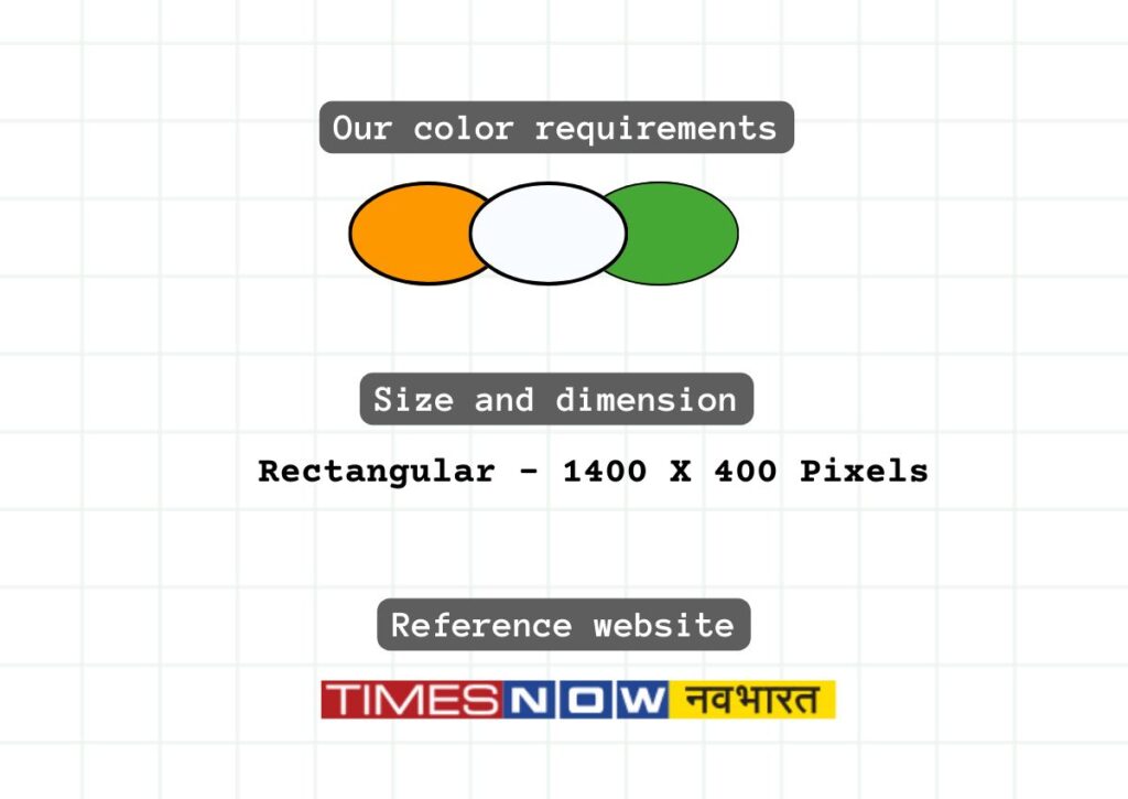
Our listed requirements are:
- It should be full text: “Jagrukbanoindia.” Plus, we want to use Hindi, if possible, to easily connect with our Hindi audience.
- Use of saffron, white, and green color (as it is the color of Indian Tiranga)
- We are okay with a rectangular-shaped logo, as we wanted to show full text in our logo.
- One of our reference logos is the Times Now Bharat logo.

Let’s now start building logo on Canva.
Creating logo
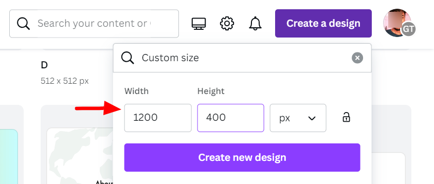
Open Canva and click on “create a new design” and select custom size. For our logo, we are proceeding with the dimensions of 1200 x 400 pixels.

Follow the following steps:
- First, I have added three textboxes: “जागरूक”, “बनो”, and INDIA.
- Then, using the “Effect” feature of Canva, we have added background to each of these three text boxes.
- Added “saffron” color for “जागरूक” and white color for “बनो” and green to “INDIA”. Plus, we separated each alphabet in India.
- Finally, after making the desired changes, I have downloaded the image as a png.
- Then use Background Remover, remove.bg, to get a background-free logo.
The logo looks perfect for my newly created blog.

To achieve a desirable result, you may need to build several versions of your logo with different sets of elements, colors, and typography.
Don’t rush; keep experimenting, and once you have a desired result, consult with your mentor or take feedback from your friends and colleagues.
How to Build an Icon?
Just as we built your logo on Canva, we will make an icon for “JagrukbanoIndia” as well. The icon size is 512 x 512 pixels.
Usually, there is a co-relation between an icon and a logo. An icon is a shorter version of a logo. In other words, your icon can be extracted from the logo itself.
As in the case of “BackLinko,” the last word “O” is used as an icon with its original design pattern. Similarly, HubSpot also uses the “O” spot as its icon.

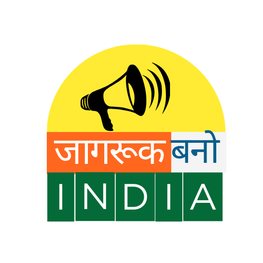
The above-designed icon is just a slight modification of the logo. The same text is rearranged in two lines with a horn to represent “awareness.” The yellow background represents light, which comes with awareness.
Some Tools to Try
Coming up with an original logo idea isn’t so simple. It comes with the exploration of multiple possibilities.
Taking the help of competitors as a reference is something we have already seen in the above example. Now, we will make use of a few online logo-making tools to spur your creativity.
These tools generate logos based on the input you provide, such as your brand name, your industry, your choice of color, graphic elements, and a few other details.
In this article, I will tell you about five logo-making tools:
- Wix Logo Maker (free signup needed)
- Logo.com
- Adobe Logo Maker
- Looka
- Tailorbrands
Places where Logo Can be used
Places to use logo:
- Website header
- Website footer
- Social media accounts
- Business card
- Business stationary
- Invoices (if you provide any service)
- Banners
Places to use icon:
- Web browser favicon
- Mobile apps icon
- On featured images, original designed images and infographics.
- Back of business card
- Social media handles
- Search results (SERP) – automatically fetched
Wrapping Up
Logo is one of the most essential branding factors; hence, keeping it unique and creative is everyone’s desire. And, if you follow my above guide, there is no need to look for a professional logo maker. Canva is enough to get you a desired logo for every beginner.
Once you have achieved enough growth, you can proceed professionally.
If you have any queries, ask in the comments.
If you are planning to start blogging – check my blogging mentorship.


