A button is a tab with links that direct you to another webpage of the same website or to another website. These buttons help users navigate different pages of your website, such as the service page, the advertise with us page, or the blog page, or perform an action like a purchase, an addition to a shopping cart, a subscription, etc.
A clickable button contains some text with a background color and a URL to which you want to direct your users. You can add some animation to make them more eye-catching. We can create these clickable buttons in “Elementor” very easily with different designs suited to your niche.
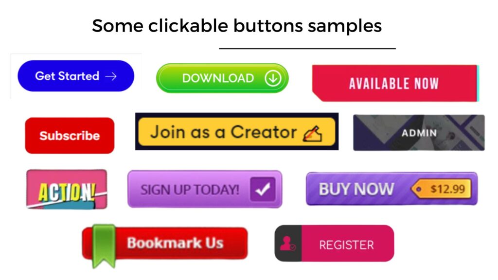
These are some samples of buttons taken from different websites. We will learn to design such buttons in Elementor editor, in this article.
Let’s start!
Adding the “button” element in Elementor
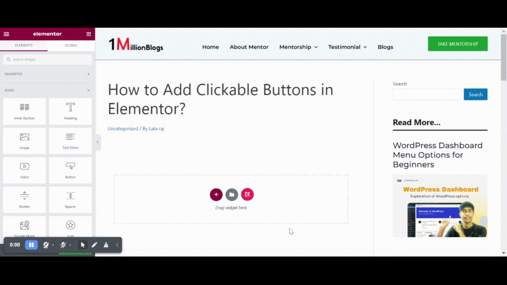
First, decide where you want to add a clickable button. Click on the “+” icon, and select a structure.
Then, an empty block will be added. Now, go to the left section of Elementor and, drag and drop the “Button” element to your empty structure on the page.
A button a with default design will be added.
Congratulations!
The next task is to design this added button as per your brand, and inserting a target URL to this button. Let’s learn that.
Steps to Design your button?
Designing the buttons is important to make them look appealing, catch the reader’s eye, and encourage them to click on them and perform the desired action.
In Elementor, we have three options with which we can completely customize a button, and the design is as per our choice. To see these options, first click on the button box (six dots on the button box in Elementor).
- Content
- Style
- Advanced.
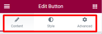
Let’s explore them one by one:
1. Content
Here, you can edit your content part, link, and the position of the button. It has the following options:
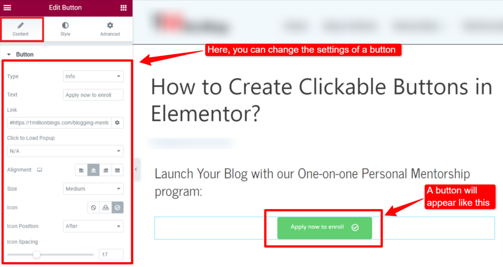
- Type: Under this option, you can select the category of your button; Default, Info, Success, Warning, or Danger. It will create some effects as per the selected type.
- Text: Here you can type the text you want on your button. It can be anything: Click here, Discover, Download, Get started, Join us, Subscribe, etc. Make it short, simple, and appealing.
- Link: Simply paste the URL of the target webpage in the available bar. To make the link open in a new tab, click on the setting icon and tick mark it. Also tick “no follow” if you don’t want to give do-follow link to the URL.
- Alignment: You can change the of the alignment of the button from this option. It can be left, right, center, or justified.
- Size: Select the desired size for the button. Some buttons are large while some are small, based on your requirements.
- Icon: Insert any icon here either by uploading your original icon or choosing from the icon library. You can also change the position of the icon; left side of the text or right side of the text.
- Icon spacing: You can apply space between the text and icon on your button by sliding the bar.
Your content part is ready for the button. Now, let’s make it more stylish.
2. Style
Here you can change the appearance of the button by selecting the text color, and background type/color, hover color, gradient color and hover effects. Explore the following options:
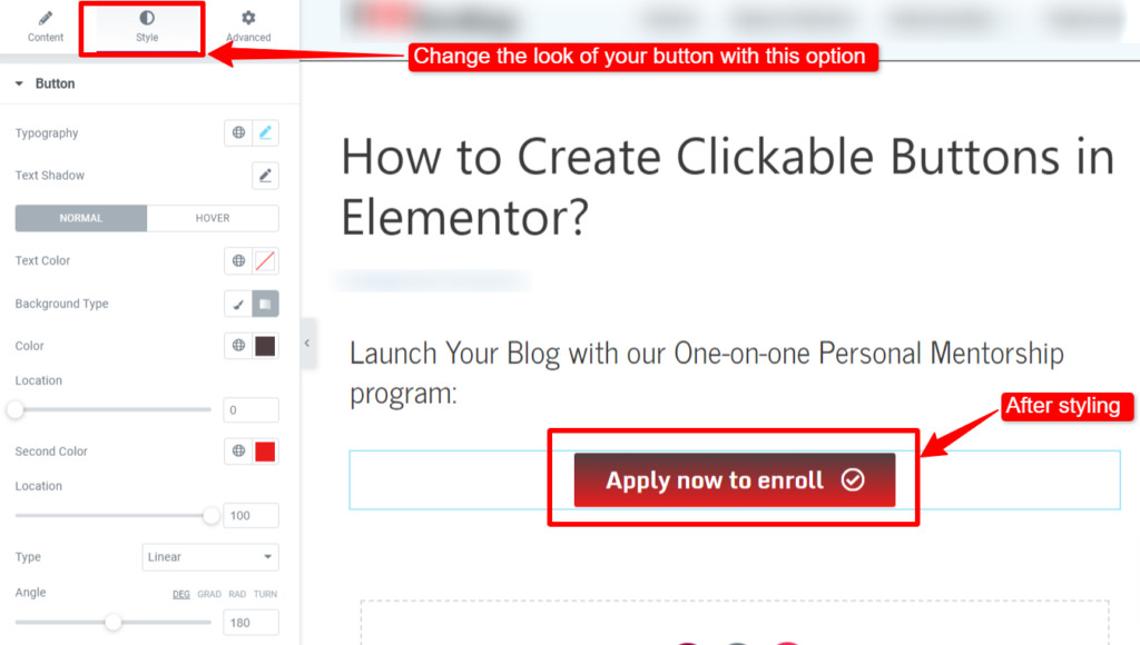
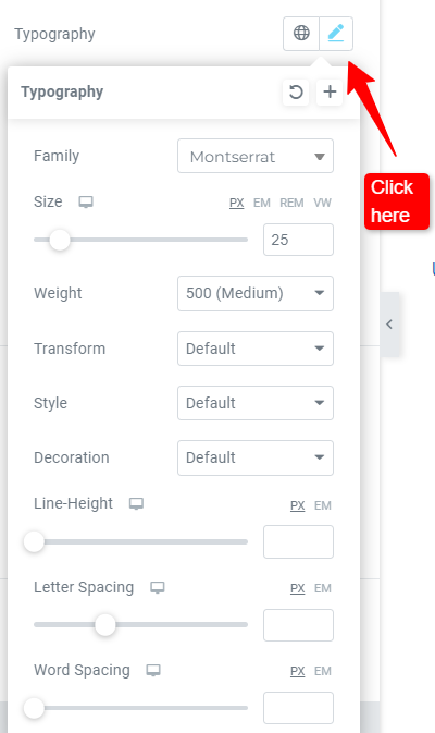
- Typography: You can change the appearance of your text such as font style, size, the weight of the text, underlining, line height, line spacing, and word spacing.
- Text shadow: Here you can create some shadow effects behind the text using different options. You can also add some dramatic effect to the button by clicking on the “Hover option”. You can choose any hover animation method you like.
- Text Color: You can change the color of your text and save it as H1, H2, or H3.
- Background Type: Choose the look of the background with single color or two color effect.
- Border type: You can create the border for the button from solid, double, dotted, dashed, or groove. You can choose the color of the border also along with its width.
- Border radius: Select the radius of your border for its corner. Zero radius will make it look like a rectangluar and higher radius will make it look circular.
- Box shadow: Just as text-shadow, here you can change the box shadow for different options given.
- Padding: You can increase/decrease the size of the button box by clicking on this option.
3. Advanced
Here you will find some advanced settings to make your button look more engaging and optimized.
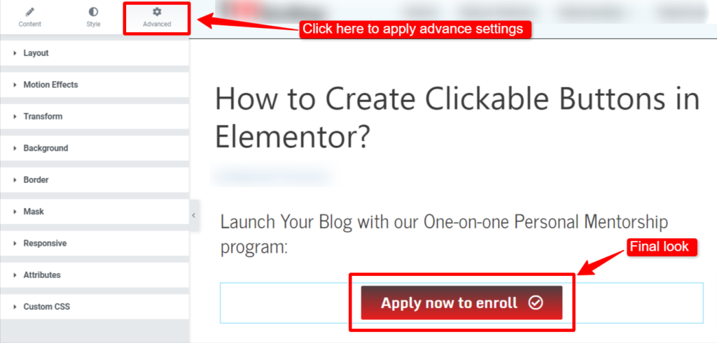
- Layout: You can change the margin, padding, width, and position of the box either left or right, etc.
- Motion effects: You can add some animation here along with its duration. When someone clicks on that button it will look creative.
- Transform: Here you can rotate or flip the button box as you like.
- Background: Change the background of the box here.
- Border: You can change the border here with size, color, and different designs.
- Mask: You can change the shape of your button box from a circle, triangle, flower, etc.
- Responsive: You can use this option to hide the button on a tablet, desktop, or mobile.
This is how you can insert and design your clickable button for your web pages. Unleash your creativity and align it with the requirements of your webpage.
Conclusion:
Use your creativity to design a the best of these clickable buttons and make them stand out. There are plenty of options available in the “Elementor” to create these buttons for your niche.
To know more about other elements of Elementor, check the session page.


